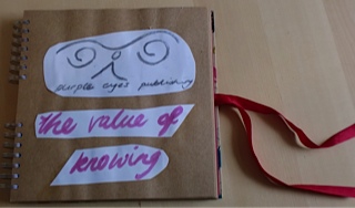
“The PEP Logo” first created in 2012
The logo for PEP (Purple Eyes Publishing) was part of a personal quest in art and design. The two spirals represent eyes opened when pivoted on a peak that has a steep side and a sloped curve. This portrays the delicate balance between hard-earned (steep-sided) understanding and sliding into familiarity (sloped curve). The overarching wave recognises the far-reaching potency of individual receptivity. Purple is often used to denote power or spirituality, and a particular mysticism or greater understanding is attached to purple eyes.
A collage now growing - the past and the present anew are now showing the many ways creativity can keep flowing...

Take a look on this website and over time you'll see, a myriad form of poetry.

The Vintage Store is there to explore...

And the new echoes back at you - it's yours to own if you want to.
Creative inspiration: so many forms of designation accentuate deliberation to bring forth years of fresh creation, and in the midst of generation, the joy of productive sensation is entirely - a rhythmic entity - of visual identity.

For what we in joy behold, we count as gold in hours lost neither to barter nor sold.

That way 'the value of knowing' unfold - in images our heart can hold.
Poetic Design to loosen the rhythm and find a new rhyme.
A breath and a freshness align - one peak at a time - to understand the sublime and keep life divine.

As with the seasons and myriad new reasons, life produces vital cohesions.

This is 'the value of knowing' that our time - is to shine - on a pure creative vine.